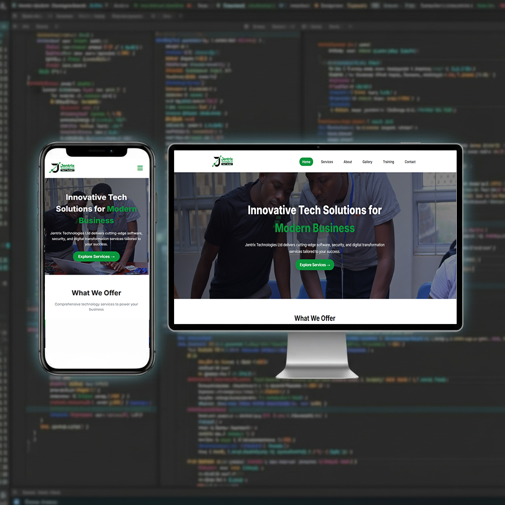
Responsive Web Design
Our responsive designs ensure your website adapts seamlessly to all screen sizes, improving user engagement and SEO rankings. We use fluid grids, flexible images, and CSS media queries to deliver a consistent experience across devices.
Key Features
Mobile‑first Approach
Touch Optimized
Fast Loading
Cross‑browser Compatible
Retina Ready
AMP Support
Why Choose This Service?
Better user experience boosts conversions
Google rewards mobile‑friendly sites with higher rankings
One website for all devices – lower maintenance
How We Work
1
Mobile UX Analysis
2
Flexible Grid Design
3
Responsive Development
4
Cross‑device Testing
5
Performance Optimization
Frequently Asked Questions
Can you make my existing website responsive?
Yes, we can retrofit responsive design to your current site.
Do you test on real devices?
Yes, we test on actual smartphones, tablets, and browsers.